Fluted vs. Reeded
I love this time of year because designers and trend setters like to predict what we will be using and seeing more of in the year to come. It’s not only inspiring, but it makes you think… is this a trend I personally love for my space? Is it a trend? Or is it perhaps a born-again classic?
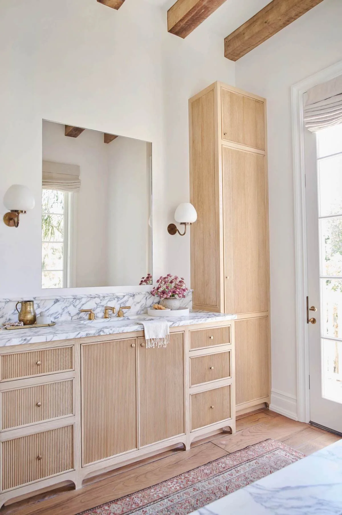
I think we will be seeing LOTS more of this in 2023. When a trend feels like a new classic…introducing the fluted and reeded surfaces. They both have such incredible impacts on otherwise smooth surfaces, and are also so different from one another. Reminiscent of classical elements found in roman architecture, these trendy textures are making such an impact on the design world.
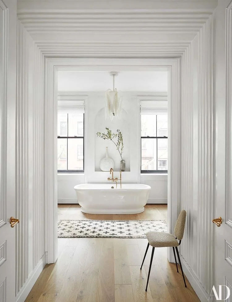
Elizabeth Rogers for Athena Calderon in Architectural Digest
Such a simple detail but if used correctly can make such a beautiful impact on the overall space.
Fluted textures are so versatile. They’re a modern look that is inspired by Roman columns. Fluting is characterized by repeated vertical ridges or “flutes” that run the length of the surface. The flutes are separated by rounded recessed areas and allow for an interplay of light and shadow.
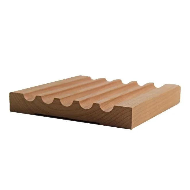
And used correctly in a space can be dramatic or subtle, bold or minimalist. It helps to see the sample to make a clear definition between fluted and it’s more rotund sister, reeded.
Zoe Feldman
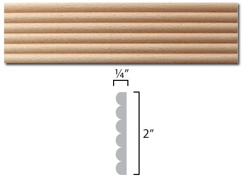
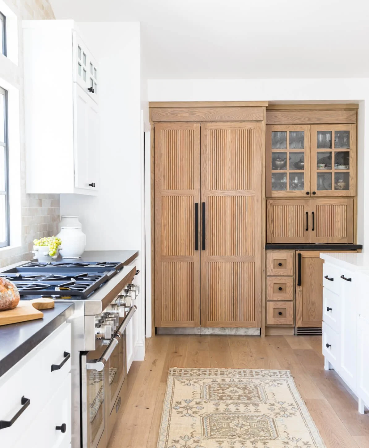
Reeding is defined as a rounded series of undulating bumps or scallops. It’s almost the opposite of fluting: instead of straight-edge flutes, the raised area is rounded. The profile looks like a scallop.
Amber Interiors
We love seeing reeded surfaces on cabinetry, walls, bases of tables and side tables. It add such a visual and textural change to a space and can really be the perfect trendy accent to bring a space together.
Lindye Galloway
As we jump into January, we plan on sharing more of our design trends and new classics that we predict will be showing up a lot on the scene, as well as our own work! Is there something you are loving and hoping to see more of? Comment below! Happy New Year y’all!
